Creating a website that truly serves its users requires more than attractive visuals—it demands a strategic approach to layout design that prioritises clarity, functionality, and intuitive navigation. Modern web users have increasingly high expectations for digital experiences, with studies showing that 94% of first impressions are design-related and users forming judgements about a website’s credibility within mere milliseconds of arrival.
The challenge lies in balancing aesthetic appeal with practical usability, ensuring that every design element serves a purpose while contributing to an overall coherent experience. Today’s successful websites employ sophisticated layout strategies that guide users effortlessly through content hierarchies, reduce cognitive load, and facilitate meaningful interactions. From typography systems that create natural reading flows to navigation architectures that anticipate user behaviour, effective layout design has evolved into a precise science backed by extensive research and user testing data.
Visual hierarchy implementation through typography and spacing techniques
Visual hierarchy forms the foundation of effective web layout design, serving as an invisible guide that directs user attention and facilitates content consumption. Research indicates that users spend an average of 5.94 seconds examining a website’s written content, making it crucial to establish clear information priorities through deliberate design choices. The implementation of robust visual hierarchy systems ensures that users can quickly identify the most important information while maintaining engagement throughout their browsing experience.
Typography serves as the primary vehicle for establishing visual hierarchy, with size, weight, and spacing variations creating natural reading patterns that align with user expectations. The human eye naturally gravitates towards larger, bolder elements before processing smaller details, a principle that forms the basis of effective content prioritisation strategies. Modern web design leverages this behavioural pattern through systematic approaches to font selection and sizing that create predictable user experiences across different devices and contexts.
Font weight contrast strategies for content prioritisation
Font weight variations provide designers with powerful tools for establishing content importance without relying solely on size increases. Strategic weight contrasts create visual anchors that help users navigate complex information structures while maintaining readability across different viewing conditions. Research shows that optimal font weight ratios typically range from 1:1.5 to 1:2 between body text and headings, providing sufficient contrast without creating jarring transitions.
Implementation of font weight hierarchies requires careful consideration of typeface characteristics and rendering capabilities across various devices. Sans-serif fonts like Inter or Roboto offer superior weight variation options compared to serif alternatives, particularly in digital environments where pixel clarity affects readability. The strategic use of font-weight: 700 for primary headings and font-weight: 600 for secondary elements creates natural progression patterns that guide user attention through content structures.
Effective font weight strategies create invisible pathways through content, allowing users to quickly scan and identify relevant information without conscious effort.
Whitespace distribution patterns for cognitive load reduction
Whitespace, often called negative space, plays a crucial role in reducing cognitive load and improving content comprehension. Studies demonstrate that appropriate whitespace usage can increase reading comprehension by up to 20% while simultaneously improving perceived content quality and professionalism. The strategic distribution of whitespace creates breathing room for visual elements, preventing the overwhelming sensation that often accompanies dense layouts.
Effective whitespace patterns follow mathematical relationships that create harmonious spacing throughout the design. The 8-point grid system has become increasingly popular among designers, providing consistent spacing units that scale appropriately across different screen sizes. This approach ensures that margins, padding, and line heights maintain proportional relationships, creating visual rhythm that enhances user experience.
Colour psychology applications in interface element distinction
Colour psychology principles provide valuable insights for creating intuitive interface hierarchies that guide user behaviour and decision-making processes. Different colours evoke specific emotional responses and carry cultural associations that influence user perception and interaction patterns. Understanding these psychological effects enables designers to create more effective visual hierarchies that align with user expectations and business objectives.
Primary interface colours should establish clear functional distinctions between different element types, with action buttons typically employing high-contrast colours that encourage engagement. Blue remains the most trusted colour for call-to-action elements, with conversion rates often 15-20% higher compared to alternative colour choices. However, context and brand identity considerations may necessitate different approaches, requiring careful testing and validation
to ensure they support, rather than undermine, clarity. Using a restrained colour palette with one dominant action colour, one neutral background, and one or two accent colours helps maintain consistency and makes it easier for users to interpret meaning at a glance. For instance, reserving a single, brand-approved colour exclusively for primary calls to action trains users to recognise where to click next without thinking. Regular A/B testing of button colours, hover states, and alert messages can validate assumptions and fine-tune how colour drives behaviour on your site.
Accessibility should always temper colour psychology decisions. Relying on colour alone to distinguish interface elements can exclude users with colour vision deficiencies and reduce layout clarity. Pair colour with text labels, icons, and clear shapes so that buttons, alerts, and links remain understandable even in grayscale. Tools like contrast checkers help you maintain WCAG-compliant ratios, ensuring that your visually driven hierarchy is also inclusive and readable in real-world conditions.
Scale progression methods using modular typography systems
Modular typography systems create predictable scale progression that anchors visual hierarchy across your website layout. Instead of assigning arbitrary font sizes, you define a mathematical scale—such as a 1.2 or 1.25 ratio—and apply it consistently from small captions through to H1 headings. This approach yields harmonious type relationships, making it easier for users to differentiate between levels of information and scan pages efficiently. Common scales include minor third (1.2), major third (1.25), and perfect fourth (1.333), each offering different levels of contrast.
In CSS, modular scales can be implemented using custom properties and relative units, allowing type to adapt responsively. For example, pairing rem-based sizes with a clamp function or design tokens in your stylesheet ensures consistent progression on both mobile and desktop. By aligning line height, margin, and padding to the same underlying scale, you reinforce a coherent rhythm throughout your layout. The result is a site where headings, body text, and UI labels feel intentionally related, supporting a clear and user-friendly reading experience.
Navigation architecture optimisation for enhanced user flow
A clear, user-friendly layout relies heavily on navigation architecture that mirrors how people naturally seek information. Even the most beautiful interface will fail if visitors cannot quickly understand where to go next. Effective navigation acts like signage in an airport: it quietly but confidently directs people through complex environments with minimal friction. When we optimise navigation structure, labelling, and interaction patterns, we reduce decision fatigue and make it easier for users to complete their goals.
Modern navigation design combines established usability heuristics with patterns tailored for multi-device usage. This means planning information architecture before visual design, grouping content into intuitive categories, and validating your decisions with card sorting or tree testing. Clear labels, predictable locations, and consistent behaviour across pages give users a sense of control. The more seamless the navigation, the more cognitive resources users can devote to engaging with content or taking action.
Breadcrumb implementation following jakob nielsen’s usability principles
Breadcrumbs provide a lightweight secondary navigation that shows users exactly where they are within your site’s hierarchy. According to Jakob Nielsen’s usability heuristics, visibility of system status and recognition over recall are key: breadcrumbs deliver both by presenting a clear path from the homepage to the current page. This reduces the effort required to backtrack or jump to higher-level categories, particularly on content-heavy or eCommerce sites. Users no longer need to rely on the browser back button or guess which menu item will take them “up” a level.
To keep breadcrumbs user friendly, follow consistent formatting and placement. Place them near the top of the content area, left-aligned, with clear separators such as > or /. Use the full hierarchical path (e.g., Home > Category > Subcategory > Item) and ensure each segment, except the last, is clickable. Keep labels short but descriptive, and map them to your main navigation terms to avoid confusion. Implementing structured data (e.g., schema.org/BreadcrumbList) also supports SEO, helping search engines understand your site’s structure.
Mega menu structure design for complex content hierarchies
When your website contains extensive categories and subcategories, a mega menu can present the structure in a single, scannable view. Unlike traditional dropdowns, mega menus expand into a full panel, allowing you to group related items, add headings, and occasionally include brief descriptions or icons. For users, this feels like unfolding a well-organised map rather than hunting through nested lists. A carefully designed mega menu can significantly improve findability for large catalogues, universities, news portals, or SaaS platforms with many features.
The key to user-friendly mega menus is disciplined organisation. Group links under clear headings that match user mental models, avoiding internal jargon. Limit the number of columns and rows so users don’t feel overwhelmed—more than three to four columns can quickly become cluttered on desktop. Maintain consistent alignment and spacing, and avoid mixing too many visual elements such as promotional banners or large images that distract from navigation. Finally, ensure mega menus are keyboard accessible and close predictably, supporting both power users and those with assistive technologies.
Progressive disclosure techniques in multi-level navigation systems
Progressive disclosure helps you keep navigation layouts clean by revealing detail only when users need it. Instead of showing every level of your site architecture at once, you surface top-level options first, then progressively expose subcategories via hover, click, or in-page expansion. This approach mirrors how we naturally explore physical spaces: we first choose a department, then a specific aisle, then a product. For complex sites, progressive disclosure prevents menu overload and keeps the initial layout clear and approachable.
Effective progressive disclosure combines careful copywriting with intuitive interaction patterns. Use concise labels and add subtle indicators (such as carets or chevrons) to show where deeper levels exist. When a user expands a navigation item, keep context visible—don’t replace the entire menu with a new view unless you provide a clear “back” path. On mobile, this often takes the form of nested panels where each level slides in while a breadcrumb-like header enables users to move up. Testing your multi-level navigation with real users will reveal whether the disclosure steps feel natural or unnecessarily complex.
Mobile-first navigation patterns including hamburger menu alternatives
Designing navigation mobile-first forces you to prioritise what truly matters, resulting in a cleaner overall layout. While the hamburger menu has become a common solution for hiding navigation on small screens, it’s not always the most user-friendly pattern. Studies have shown that burying primary links behind an icon can reduce discoverability and engagement, particularly for less tech-savvy users. Whenever possible, expose your most important navigation options directly within the mobile viewport.
Alternatives include tab bars at the bottom of the screen, priority+ menus that show key items and tuck the rest behind a “More” label, or horizontally scrollable navigation chips. These patterns keep core paths visible and tap-friendly, improving clarity and speed of use. If you do use a hamburger icon, pair it with the text label “Menu” and ensure the panel that opens is well-organised with clear section headings. Always consider thumb reach zones and tap targets of at least 44x44px to keep your mobile navigation genuinely user friendly.
Grid system integration and responsive layout frameworks
A clear site layout almost always rests on a strong grid system. Grids act like the underlying skeleton of your design, aligning text, images, and components so that nothing feels randomly placed. This structural consistency helps users predict where to find navigation, content blocks, and calls to action as they move through pages. In the responsive era, grid systems and layout frameworks also ensure that your site remains coherent as it adapts to different screen sizes and orientations.
Whether you build your own grid or rely on frameworks like Bootstrap, Tailwind, or CSS Grid, the goal remains the same: balance flexibility with order. Define your columns, gutters, and breakpoints based on real device widths and content needs, not just arbitrary numbers. By integrating grids with design tokens and component libraries, you create a repeatable system that different designers and developers can follow. This reduces layout inconsistencies and accelerates future iterations or A/B tests.
CSS grid implementation for complex layout structures
CSS Grid gives you fine-grained control over complex layouts without relying on nested floats or excessive wrappers. It allows you to define rows and columns explicitly, place items by line numbers or named areas, and rearrange the entire layout at different breakpoints with minimal code changes. For dashboards, magazine-style homepages, or multi-column content layouts, CSS Grid can dramatically simplify both markup and maintenance. It also enhances readability by aligning related elements consistently across the page.
To keep CSS Grid implementations user friendly, start with a simple grid template and expand only as needed. Use properties like grid-template-columns: repeat(12, 1fr); for flexible 12-column systems, and apply gap to manage consistent spacing. Named grid areas can make complex arrangements easier to understand, particularly in larger codebases. At smaller viewports, you can collapse multiple columns into a single column layout with a few media queries, ensuring users on mobile devices still experience a clean, linear reading flow.
Bootstrap 5 flexbox utilities for component alignment
While CSS Grid excels at macro layout, Flexbox remains ideal for aligning components within those grid cells. Bootstrap 5 leverages Flexbox heavily through its utility classes, allowing you to control alignment, justification, wrapping, and ordering without writing custom CSS. This is especially useful for navigation bars, card decks, call-to-action rows, and form layouts where horizontal and vertical centering are critical for clarity. Using a well-known framework can also speed up development and reduce layout bugs.
For example, classes like d-flex, justify-content-between, and align-items-center help you quickly refine how elements sit in relation to each other. On smaller screens, you can switch direction with flex-column to maintain a clean vertical flow. However, it’s important not to overuse utility classes to the point where HTML becomes unreadable. Establishing patterns—such as standardised button groups or section headers—keeps your codebase manageable and your visual layout consistent from page to page.
Container queries usage in modern browser environments
Container queries represent a major shift in responsive design, allowing components to adapt based on the size of their parent container rather than the entire viewport. This is particularly powerful for modular, card-based layouts where the same component might appear in a narrow sidebar or a wide main column. Instead of writing complex viewport-based media queries, you can let each module respond intelligently to its own context, improving clarity and usability.
As modern browsers roll out support for container queries, you can begin applying them to key components such as navigation bars, hero sections, and feature cards. For instance, a card might display an image above text in narrow containers and alongside text in wider ones, without affecting other instances elsewhere on the page. When adopting this technique, progressively enhance your layout: provide a solid baseline using traditional media queries, then layer container-specific rules for users on supported browsers. This ensures your site remains functional and user friendly across the full spectrum of devices.
Viewport unit applications for fluid typography scaling
Viewport units like vw and vh enable typography and spacing that scale smoothly with the browser window, enhancing layout clarity on extremely large or small screens. When used thoughtfully, fluid type systems prevent jarring jumps in text size at breakpoint boundaries and maintain an optimal line length for readability. For example, combining clamp() with viewport units and rem values allows you to define a minimum, preferred, and maximum font size that adapts naturally as the viewport changes.
However, it’s crucial to avoid extremes where type becomes unreadably tiny on mobile or absurdly large on ultra-wide monitors. A balanced approach might look like font-size: clamp(1rem, 1.2vw, 1.5rem); for body copy, paired with slightly more aggressive scaling for headings. Test your fluid typography across real devices to ensure it supports, rather than undermines, layout clarity. When done well, users experience a consistent hierarchy and comfortable reading experience, regardless of where or how they access your site.
Content organisation methodologies using card-based design systems
Card-based design systems offer a versatile way to organise content into digestible, repeatable units. Each card acts like a compact information container—holding a title, snippet, image, and action—making it easy for users to scan options and decide what to explore next. You can think of cards as digital index cards or store shelves: they group similar items visually, reduce clutter, and support rapid comparison. This structure is particularly effective for blogs, product listings, feature overviews, and resource libraries.
To keep card layouts clear and user friendly, maintain consistent patterns across all cards in a given grid. Align headings, meta information, and buttons in the same positions so users don’t have to relearn the layout with each new card. Limit each card to one primary action—such as “Read more” or “View details”—to avoid choice overload. Additionally, ensure sufficient spacing between cards and use hover or focus states to signal interactivity. On mobile devices, cards should stack in a single column with generous padding, preserving readability and tap accuracy.
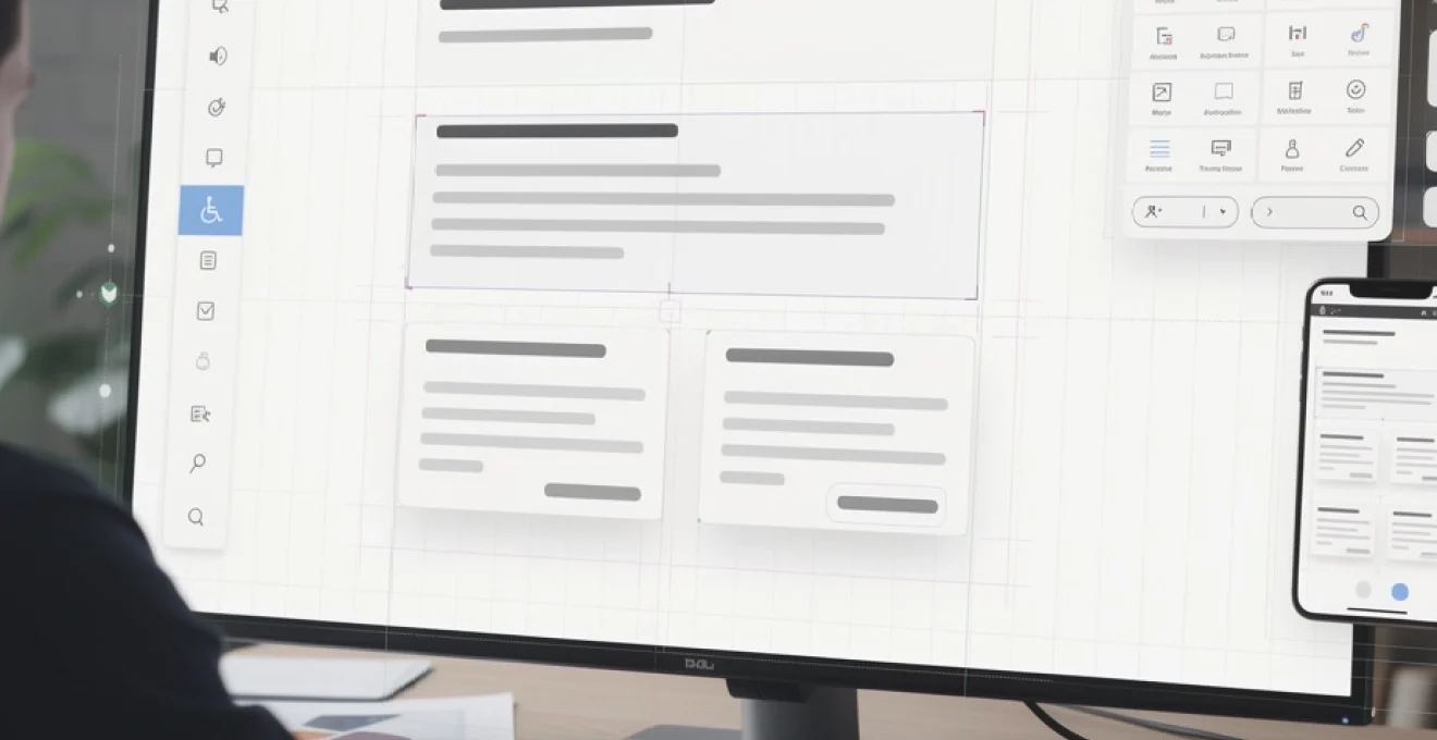
User interface consistency standards and design token implementation
Consistency is one of the strongest levers you have for making a layout feel intuitive. When buttons, forms, headings, and icons behave the same way across your site, users quickly build an internal model of how things work. This reduces cognitive load and helps visitors focus on their goals rather than deciphering new patterns on every page. Establishing user interface standards—documented in a design system or pattern library—creates a shared language for designers and developers, preventing visual drift over time.
Design tokens sit at the heart of many modern design systems, translating visual decisions into reusable variables such as --color-primary or --spacing-md. By centralising these values, you make it easier to keep layouts consistent even as your site evolves. Tokens can govern colour, typography, spacing, radii, shadows, and more, ensuring every component inherits the same core rules. When a brand refresh occurs, updating tokens propagates changes across the interface without rewriting individual components. This not only saves time but also preserves the clarity and coherence of your layout as it scales.
Accessibility compliance through WCAG 2.1 AA standards integration
Accessibility is fundamental to a clear and user-friendly layout—if people cannot perceive or interact with your content, the design has failed its most basic purpose. WCAG 2.1 AA standards provide a widely recognised benchmark for building inclusive experiences that work for users with diverse abilities. Meeting these guidelines also improves usability for everyone, from users on low-contrast screens to those navigating with keyboards or voice commands. In many regions, accessibility is not just best practice but a legal requirement.
Integrating WCAG 2.1 AA into your layout design means considering contrast ratios, keyboard navigation, focus visibility, and semantic structure from the outset. Ensure that interactive elements are clearly distinguishable and have large enough hit areas, especially on mobile. Use proper heading levels to reflect content hierarchy so that screen reader users can skim pages as efficiently as sighted users. Provide text alternatives for images, captions for video, and avoid relying on colour alone to convey meaning. By weaving accessibility into every layout decision, you create a site that is not only compliant but genuinely welcoming and usable for all visitors.